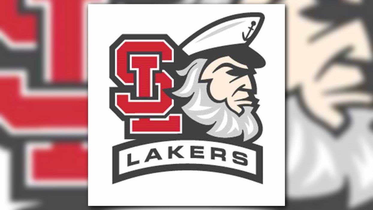
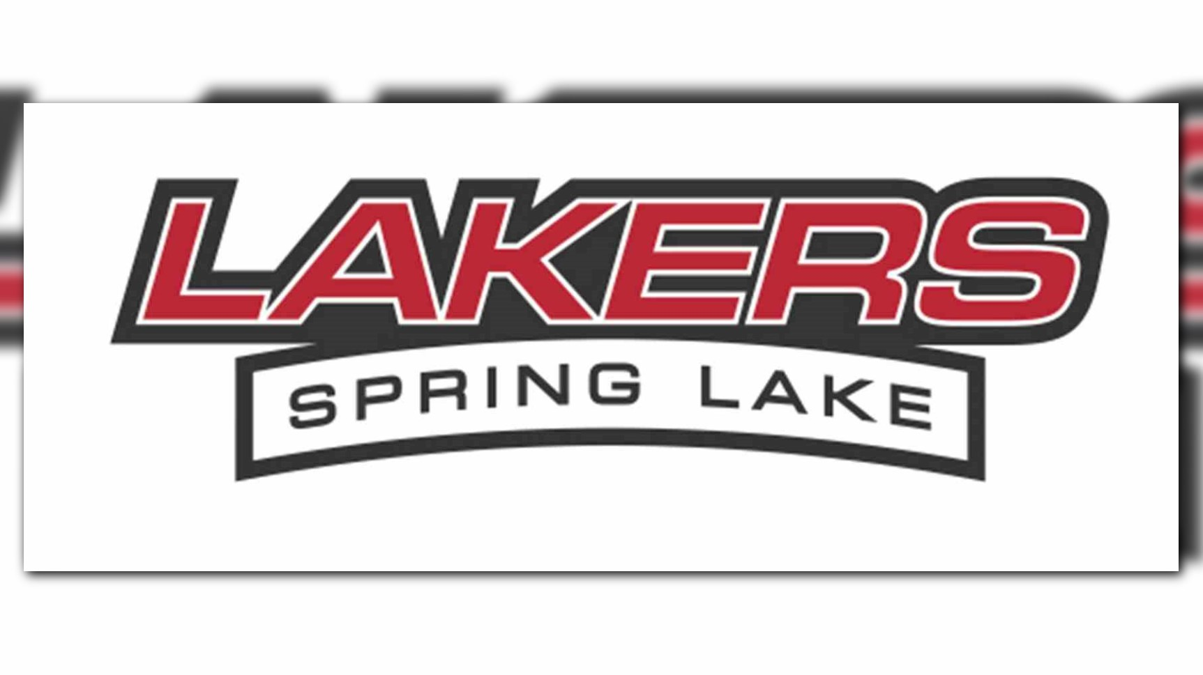
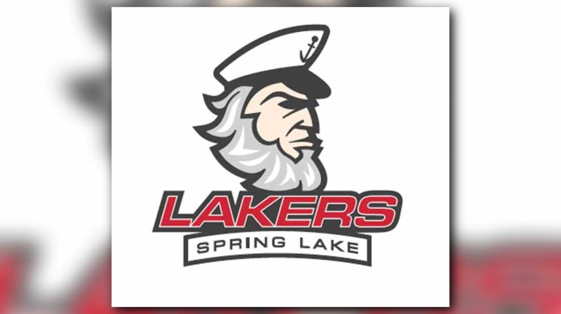
Logos used for Spring Lake Public Schools are getting a more unified look.
As part of the voter-approved bond projects, the district’s Board of Education recently approved the proposed identity guide, which makes changes to the interlocking “SL,” Larry the Laker and Spring Lake Public Schools logos.
According to the Grand Haven Tribune, the new website and branding work is slated to cost about $100,000.
Over the years, the district has used different logos with varying fonts and the sports teams used logos that weren’t approved by the school board, said Superintendent Dennis Furton.
“The brand identity guide will firm up our use of all of those and much more so that we rely on a consistent brand and logo,” he said.
About 45-50 parents, students, staff and school board members worked in focus groups to provide their feedback and different perspectives. The groups discussed what people liked about Spring Lake, positive attributes of the district, perceptions of the district and challenges of the district. The comments were used to create the district’s identity and define the brand.
The group met at the beginning of the progress, and their input helped influence the website structure, logo and the new website’s copywriting, Furton said.
In the new logo, “SL” is more closely interlocked. Larry the Laker has a more modern look and lacks a pipe.
Furton said there was “no conscious decision” to remove Larry’s pipe as they considered what a “modern Larry” would look like. The pipe and older renditions of Larry are part of the district’s history, and it will be in the archives and used from time to time, Furton said.
The primary color palette includes pantone (a shade of red), charcoal and white. The supporting palette includes black, silver and light gray. Those are colors the Spring Lake Board of Education approved more than a decade ago.
Curt Theune, a school board trustee and Spring Lake alumnus, said he’s had time to adjust to the changes. He said he likes some of the color schemes and the way Larry the Laker is used along with the interlocking “SL” in some of the variations.
Theune said he would have liked to see a committee of students, alumni, staff and community members involved in creating the designs at the infancy stage of the project instead of providing feedback on completed renditions. He said there should have been more communication along the way because it’s a big decision.
“It should have involved numerous levels of people,” Theune said.
The district’s new website will go live either later this month or early August. The new designs were being rolled out during the most recent Shindig, and it will appear in back-to-school offers, Furton said.
Old merchandise is currently being sold and the new merchandise will be available this fall.
Theune said he believes people should be able to purchase the new and old designs with versions of Larry the Laker that they are familiar with simultaneously, as is done with merchandise for college and professional sports teams.
Although being a Laker has different meanings for different people, Furton said that it’s something Spring Lake shares and is a “symbol of home and school.”
“It's both where we are from and it represents all the remarkable things that our school district does in support of our community and students,” he said. “A unified logo consistently utilized will be something that, when you see it in Spring Lake, Lansing or Europe, you'll know you're close to someone from home.”